A watercolor artist explains why original paintings hold texture, light, and human presence that even the best prints cannot replicate.
By Joy — watercolor artist, Kolkata. Exhibited at Indian Art Carnival, Shantiniketan 2025.
I have spent years painting on paper with water and pigment, and I have watched people stand in front of my work and lean in. Not to read the label. Not to check the price. Just to get closer, because something about it pulls them.
That pull is real. It is not marketing language. It is physics, chemistry, and the particular way human beings respond to evidence of another human being's hand.
This post is my attempt to explain exactly what is happening when you feel that pull — and why a print, however technically excellent, cannot replicate it.
What Actually Happens When You Paint in Watercolor
Before we talk about what you see as a buyer, it helps to understand what actually happens during the making.
Watercolor is not applied to paper. It is absorbed into paper. When I mix a wash and lay it down, the water carries the pigment into the fibres of the cotton sheet. As the water evaporates, the pigment settles — sometimes evenly, sometimes in granular clusters, sometimes pushed to the edges of a wet area in what painters call a bloom or a hard edge. I have some control over this. Not total control. The water makes its own decisions.
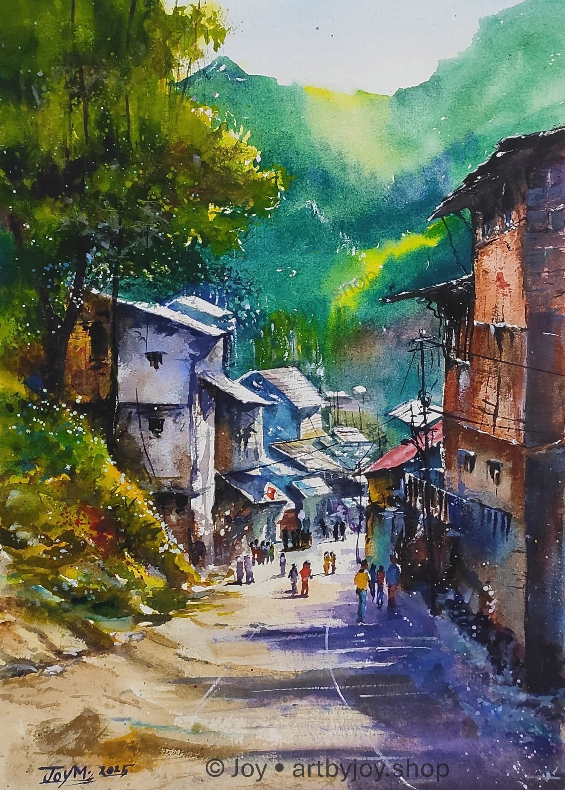
This is why no two watercolor paintings are ever identical. Even if I painted Monsoon Village again tomorrow using the same reference, the same palette, and the same paper, the water would flow differently. The humidity in the room would be different. The bloom would spread a millimetre further in one direction. The painting would be a different object.
A print captures the final photograph of that event. The original holds the event itself.
Seven Reasons Originals Feel Different
1. The paper has physical geography
High-quality watercolor paper — I work primarily on 300gsm cold-pressed cotton — has what painters call tooth. Small hills and valleys in the surface. When pigment settles into this terrain, the raised fibres catch the light differently from the recessed areas. The painting has micro-topography.
You cannot see this in a photograph. You can almost feel it with your eyes when you stand close enough.
Prints are applied on top of a surface. Originals are part of one. That is the entire difference in one sentence.
2. Light behaves differently on an original
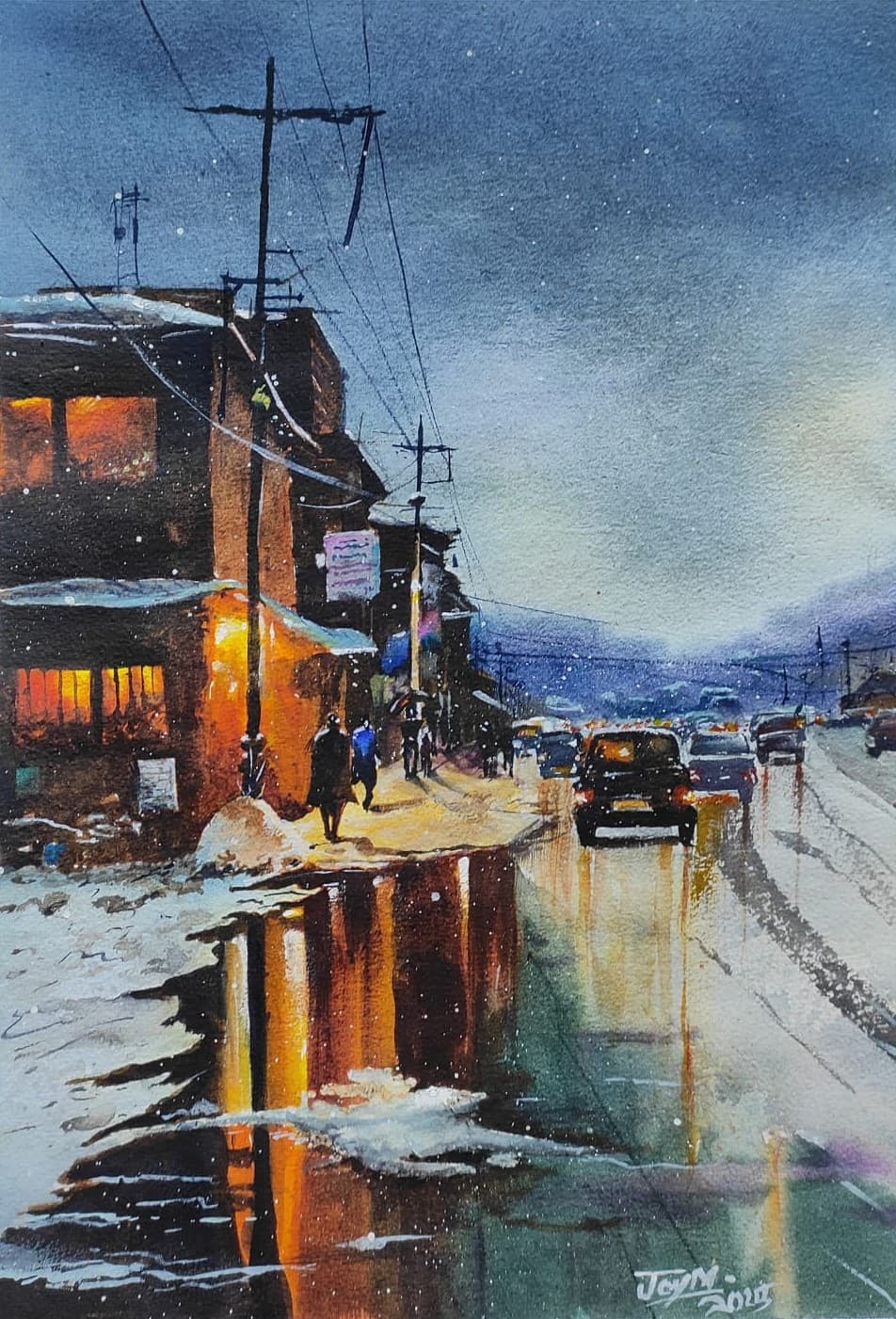
In a genuine watercolor, light travels through the transparent layers of pigment, hits the white paper underneath, and reflects back through the pigment to your eye. This is why watercolors are described as luminous. The light is not bouncing off the surface. It is passing through layers and returning.
In a print, the ink sits on top of the paper. The light reflects off the ink. It is a fundamentally different optical event, and your eye registers the difference even when your brain does not consciously identify it.
This is why originals often seem to glow. The source of the light appears to be inside the painting rather than on top of it.
3. The marks are honest
In an original, you can see exactly what the artist did and in what order. Watercolor is mostly irreversible, which means every decision is preserved. You see the first light wash. You see the second layer dropped in while the first was still wet, and the soft edge that resulted. You see where I changed my mind and lifted pigment with a damp brush, leaving a faint ghost of the original mark.
These are not imperfections. They are the record of a thought process, made visible. When you look at Where the Light Waits, you are reading decisions made in real time by a person who was trying to hold a feeling before it slipped away.
A print reproduces the outcome. The original contains the reasoning.
4. Granulation is impossible to fake convincingly
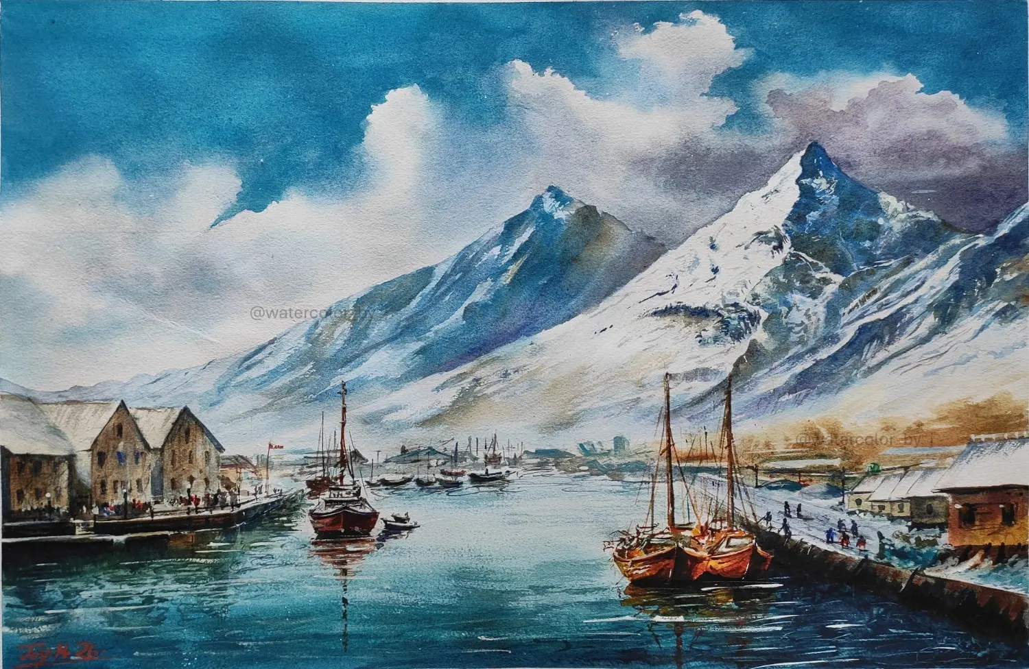
Certain pigments — ultramarine blue, burnt sienna, some of the earth colours — are granulating. The particles are heavy enough that as the water dries, they cluster together rather than settling uniformly. This creates a subtle, gritty texture within a wash that looks almost like sediment settling in still water.
You can see granulation clearly in the mountain passages of Silent Harbor at North and in the foreground washes of several Kumaon pieces.
Printers can approximate the visual pattern of granulation, but the actual physical texture is absent. Under raking light — light coming from the side — an original with visible granulation and a print of the same painting look completely different.
5. The colours have depth, not accuracy
Print technology has become extraordinarily good at colour accuracy. A high-quality giclée can match the hue of an original very closely under controlled lighting.
What it cannot match is colour depth. In a watercolor, the apparent colour of any passage is the result of multiple transparent layers, each slightly different, combined with the reflectivity of the paper underneath. The colour you perceive shifts slightly depending on the angle of light and your viewing distance.
Printed colour is what it is. Painted colour is a relationship between light, pigment, paper, and the position of the viewer. That relationship is alive in a way that a fixed ink layer is not.
6. Uniqueness changes how you feel about owning it
There is one Lone Fisherman and Sunset in the world. One specific sheet of paper on which the water moved in that specific way on that specific afternoon. When you own it, you are the custodian of something that cannot exist again.
This is not a sentimental argument. It is a factual one. And it changes the psychological relationship you have with the object on your wall. Originals become part of your home's history. Prints decorate it.
7. You are buying the artist's time, not their image
A print is the artist's image, reproduced. An original is the artist's time, materialised. For a 10 by 14 inch landscape, I typically spend between six and twelve hours across the sketching, multiple wash layers, drying periods, and finishing. That time is physically present in the object. The decisions, the corrections, the moments where something unexpected happened and I either worked with it or around it.
When you buy an original, you are buying evidence of a person trying hard at something difficult. That has a different weight to it than owning a copy of the result.
Prints Are Not the Enemy
Honesty matters here. I make prints available from my own work, and I do not think less of anyone who buys them.
Prints make art accessible. They are the right choice when you are decorating a high-humidity room, when you need a specific size that original paper does not come in, when you want to bring a particular image into a child's room without worrying about it, or when budget is genuinely the constraint.
The distinction worth drawing is this: a print is an image of art. An original is art. Both can be beautiful. Only one of them is alive in the way I have been describing.
How to Choose
Choose an original watercolor if you want a focal point in a room you care about, you value the physical and optical qualities that only a hand-painted work can have, you want something that is genuinely yours and no one else's, or you are beginning to collect with an eye toward what holds meaning over time.
Originals work best in living rooms, home offices, and master bedrooms — spaces where you sit with the work regularly and notice different things about it as the light changes.
Choose a print if you are working within a tight budget, you need a large format that exceeds what watercolor paper allows, or you want cohesive art across multiple rooms without the investment that originals require.
A Note on What You Deserve to Know Before Buying
The word "original" is used loosely online. Some listings use it to mean "original design" (meaning the image was created by a human, not copied) while selling printed reproductions. Others use it accurately.
The clearest test: if the quantity is more than one, it is not an original painting. If the listing does not mention specific materials, dimensions, and year of creation, ask. If the price is lower than the cost of the materials used to make it, it is not a painting.
For more on navigating this, the post on how to buy original watercolor paintings online covers every verification step in detail.
Final Thought
You should buy art because it makes you stop. Because it changes something about the room when you walk in. Because it earns a second look after you have lived with it for a year.
If a print does that for you, it is money well spent.
Ready to choose? If you want to understand the practical side of this, read the guide on how to buy original watercolor paintings online, which covers everything from paper weight to payment security.
If you want to dive deeper into the technical side, my post on What Makes Watercolor Unique explains the physics of transparent pigment in more detail.
Browse available original watercolor landscapes, explore the narrative collection, or get in touch to discuss a commission.
Recommended Reading
- How to Buy Original Watercolor Paintings Online — The complete collector's guide.
- What Makes Watercolor Unique — An artist's perspective on the medium.
- How to Buy Art Directly From an Artist — Understanding the direct-to-collector relationship.
Frequently Asked Questions
Why do original watercolor paintings look different from prints in person? The main reason is light behaviour. In an original watercolor, light passes through transparent layers of pigment, reflects off the white paper underneath, and returns to your eye through the pigment. This creates luminosity from within. Prints reflect light off an ink surface, which produces a fundamentally different optical result. The physical texture of the paper also plays a role — originals have a surface topography that shifts under different lighting conditions.
Is a giclée print the same as an original watercolor painting? No. A giclée is a high-quality inkjet reproduction. It can be colour-accurate and beautiful, but it is a print of the original painting, not the painting itself. The texture, luminosity, and uniqueness of the original are not present in a giclée.
Can you tell the difference between an original watercolor and a print from a photograph? Sometimes, but not reliably. Photographs of originals often show texture and paint behaviour (blooms, granulation, soft edges) that prints do not have. The clearest test is in person: under raking light, an original has visible surface texture and the colour shifts slightly with viewing angle. A print looks the same from every angle.
Do original watercolor paintings increase in value? Original paintings by exhibited artists have the potential to appreciate over time, particularly as the artist's career develops. Prints generally do not appreciate in the same way, though limited edition prints by well-known artists can be exceptions. For most collectors buying from practicing artists, the personal value of an original typically outweighs any financial calculation.
What makes a watercolor painting unique compared to other mediums? Watercolor is unique because it cannot be fully controlled. The water carries the pigment and makes decisions the artist cannot entirely predict or reverse. Granulation, blooms, and hard edges are all results of the water acting on its own terms. This unpredictability is part of what gives watercolors their organic quality — and it means no two works, even by the same artist on the same subject, are ever identical.
How do I know if an online listing is for a genuine original watercolor painting? Look for specific materials listed (paper type, gsm weight), exact dimensions, year of creation, and an edition of one. Ask for a close-up photograph of the surface. A genuine artist will provide one. If the quantity is more than one, if the price seems impossibly low, or if the seller cannot describe the making of the specific piece, treat it with caution.
Written by Joy Mukherjee
Joy Mukherjee is a watercolor artist who paints landscapes, village scenes, and atmospheric moments using transparent watercolor on premium 100% cotton watercolor paper. His work is born from memory, light, and atmosphere.